CSS中的渐变效果,学习笔记。
linear-gradient1 2 3 4 linear-gradient( [ <angle> | to <side-or-corner> ,]? <color-stop> [, <color-stop>]+ ) \---------------------------------/ \----------------------------/ Definition of the gradient line List of color stops
<angle>| to <side-or-corner>用来描述渐变发生的方向或角度的。未指定时,默认是由上至下进行渐变。<color-stop>由一个<color>值组成,并且跟随着一个可选的终点位置(可以是一个百分比值或者是沿着渐变轴的<length>)。取值如:#FF837E 80%或者blue 30px。
它分为两组参数,第一组参数用来描述渐变线的起点位置,to top这样的值会转换为0度,to left会被转换为270度。第二组参数可以包含多个值,用逗号分隔,每个值都是一个色值,后面跟随一个可选的终点位置,终点位置可以是百分比也可以是绝对值
CSS规范规定,如果某个色标的位置值比整个列表在它之前的位置都要小,则改色标的位置会被设置为它前面的额所有色标位置值的最大值,所以可以使用0来指代前面的颜色的位置最大值
(1)默认效果
1 2 3 .container { background : linear-gradient (white, black); }
(2)从左到右的渐变:
1 2 3 4 5 .container { background : linear-gradient (to right, white, black); background : linear-gradient (90deg , white, black); }
(3)从左到右渐变,渐变位置发生在中间的一小部分(20%左右)
1
2
3
.container { background : linear-gradient (to right, white 40% , black 60% ); }
(4)突然变色
如果多个色标具有相同的位置,他们会产生一个无限小的过渡区域,过渡的起止色分别是第一个和最后一个指定值。从效果上看,颜色会在那个位置突然变化,而不是一个平滑的渐变过程。
1
2
3
4
5
.container { background : linear-gradient (to right, white 50% , black 50% , black 100% ); background : linear-gradient (to right, white 50% , 0 , black 100% ); }
(5)边框渐变
三种渐变都属于CSS数据类型中的<gradient>类型,而<gradient>数据类型又是<image>数据类型的子类型。所以有时能应用到<image>的地方同样也可以应用到<gradient>,比如我们可以利用border-image属性来实现边框的渐变。如下面的效果:
1 2 3 4 .container { border : 10px solid transparent; border-image : linear-gradient (to right, white, black) 10 ; }
(6)条纹进度条(竖直)
1 2 3 4 5 6 7 8 9 10 11 12 13 14 15 16 17 18 19 20 21 22 .container { width : 500px ; height : 20px ; border-radius : 5px ; } .container :after { content : '' ; display : block; width : inherit; height : inherit; border-radius : inherit; background : linear-gradient (90deg , black 50% , darkgoldenrod 0 ); background-size : 20 ; animation : loading 10s linear infinite; } @keyframes loading { to { background-position : 100% 0 ; } }
(7)条纹进度条(倾斜)
倾斜的话,除了修改角度之外,还需要细化色阶值,让色块充满backgroun-size的范围内,只需要修改:
1
2
3
4
.container :after { background : linear-gradient (45deg , black 0 , black 25% , darkgoldenrod 0 , darkgoldenrod 50% , black 0 , black 75% , darkgoldenrod 0 , darkgoldenrod 20px ); }
(7)桌布效果
使用backgroun-image绘制多个背景图像,进行叠加:
1 2 3 4 5 6 7 8 .container { width : 210px ; height : 210px ; background-color : #FFF ; background-image : linear-gradient (90deg , black 50% , transparent 0 ), linear-gradient (black 50% , transparent 0 ); background-size : 20px 20px ; }
径向渐变 1 2 3 4 5 6 7 8 radial-gradient( [ [ circle || <length> ] [ at <position> ]? , | [ ellipse || [ <length> | <percentage> ]{2} ] [ at <position> ]? , | [ [ circle | ellipse ] || <extent-keyword> ] [ at <position> ]? , | at <position> , ]? <color-stop> [ , <color-stop> ]+ )
可以简化为:
1 radial-gradient(shape size position, color-stop[...,color-stop]);
position,代表径向渐变的圆心位置,默认值是中心点shape,径向渐变的形状,可以为circle或者ellipse(默认)size,代表径向渐变范围的的小,shape为ellipse需要指定两个值,比如20%, 30%,前者代表相对元素宽度的20%,后者代表相对高度的30%,也可以用关键字
(1)中间到四周渐变:
1 2 3 .container { background : radial-gradient (white, black) }
(2)半椭圆形渐变,由左侧中心点到四周
1 2 3 .container { background : radial-gradient (ellipse 100% 50% at left center, white, black) }
(3)从左上角到右下角的发散式渐变
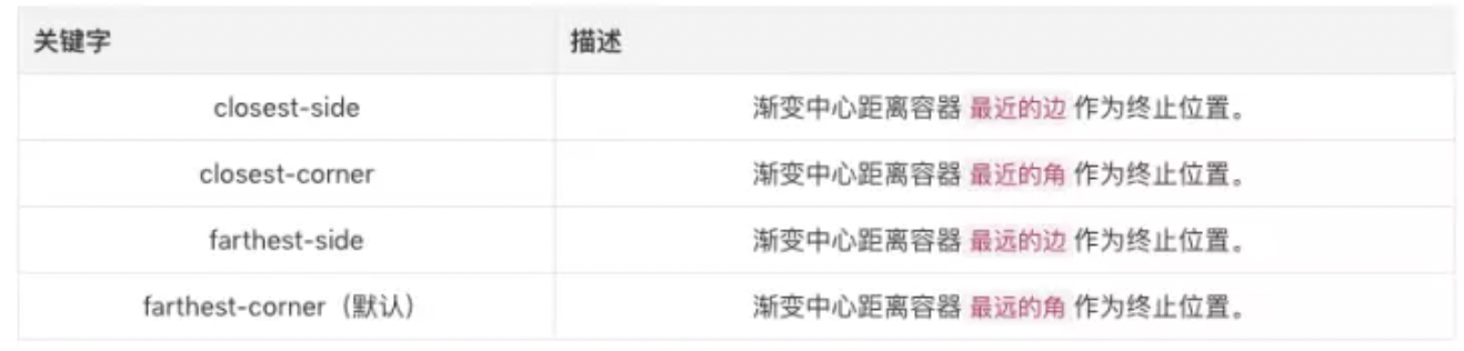
1 2 3 .container { background : radial-gradient (circle farthest-corner at left top, white, black) }
(4)指定颜色渐变范围
1 2 3 .container { background : radial-gradient (ellipse 50% 30% , white 30% , black 70% ) }
重复渐变 重复渐变分为两种:线性重复渐变和径向重复渐变,语法都与普通的渐变相同。
repeating-linear-gradientlinear-gradient,并且采用相同的参数,但是它会在所有方向上重复渐变以覆盖其整个容器。
其实repeating-linear-gradient的效果大多数时候可以用linear-gradient + background-repeat + background-size实现,上面的倾斜的进度条用repeating-linear-gradient也可以直接实现,关键点就是色阶值改用固定尺寸而非百分比,不再需要background-size,因为repeating-linear-gradient会自动充满容器了
1 2 3 4 5 6 7 8 9 10 11 12 13 14 15 16 17 18 19 20 21 .container { width : 500px ; height : 20px ; border-radius : 5px ; } .container :after { content : '' ; display : block; width : inherit; height : inherit; border-radius : inherit; background : repeating-linear-gradient (45deg , black 0 , black 10px , darkgoldenrod 0 , darkgoldenrod 20px ); animation : loading 10s linear infinite; } @keyframes loading { to { background-position : 100% 0 ; } }
更多的渐变效果可以直接Copy这个网站 。
参考